At last here is an update on our project. We have been getting used to being back in California after a few months in Finland and I have to say, it's been a bit of an adjustment. We would like to thank Pirjo for arranging our housing and giving us a lift to the K-Market on our first visit, we thank Leena for battling the wind and the waves to take us grocery shopping when we came up in June, and for sharing her beautiful work with us--how we wished we could read Finnish! And of course big thanks to the Finnish Bioart Society for making this residency possible! Moving forward on this project has been a welcome distraction and a really juicy problem for me to sink my creative teeth into.
My original goal was to come up with a way to allow the viewer to experience the landscape on a macro and micro scale at the same time. My solution is a series of diptychs--each pair will contain a traditional landscape painting, and its companion--what I've been calling the "data painting". This will be a copy of the landscape painting in grayscale, with the data--the snow characteristics and the microbial activity--rendered in color. I have come up with a painting composition for each of the 4 sites where David collected snow last March: the lake, the mountain birch forest, the transitional zone, and the alpine zone (high and medium alpine were combined--low alpine was eliminated). We decided on the most important measurements for me to represent in the data paintings. They are 1) Snow Depth, 2) Snow Temperature, and 3) Snow Density. Snow depth will be quite literal--the amount of room the snow takes up in the composition will correlate to the depth measurements from the four sites. Snow temperature will be represented by a color gradient, and snow density by a value gradient. I believe I will be adding two more pairs of paintings from our June visit to the field station, but this post will focus on the winter paintings.
I feel that a real challenge in science-art collaborations is for the artist to integrate the science and art in a meaningful way. Therefore, I tried to come up with a reasonably quantitative approach to visualizing the data in the paintings. Here's what I came up with:
SNOW DEPTH
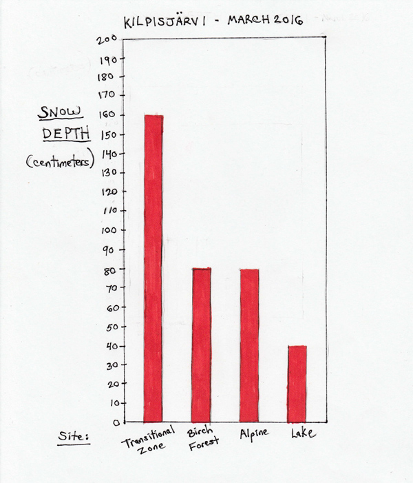 As you can see, the snow was the deepest at the transitional zone site, at 160 cm. The lake site snow depth was one-fourth of this, and the alpine and birch forest sites were one-half. I composed the paintings to reflect this, as illustrated below:
 These are thumbnail sketches of the full-sized oil paintings, which measure 61 x 45.7 cm. on cradled board.
SNOW TEMPERATURE
David measured the temperature of the snow at different levels for each site. He made a regression curve to help me with my visualization. See chart below:
These are thumbnail sketches of the full-sized oil paintings, which measure 61 x 45.7 cm. on cradled board.
SNOW TEMPERATURE
David measured the temperature of the snow at different levels for each site. He made a regression curve to help me with my visualization. See chart below:
 I decided to use hue (i.e.; color--red, green, yellow, etc.) to convey temperature. The color gradient goes from green (warmest) to purple (coldest). I drew a graph with the curves from each of the four sites and used this to define the colors that will be used.
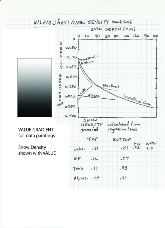
 SNOW DENSITY
measured by grams per cubic centimeter of snow. Once again, David made a chart with regression curves:
SNOW DENSITY
measured by grams per cubic centimeter of snow. Once again, David made a chart with regression curves:
 I combined these into one graph which I used to make a value scale to express the density of the snow:
 That's it for the snow measurements, next up I will post the "snow palettes" for each painting and move on to microbial activity...or as David likes to call it, "the hidden world of snow".